Techniques for Centering with CSS
Let's explore some options to center an element in CSS both horizontally and vertically, which is a common situation you might encounter.
We'll start with by looking at a teal blue container box with a smaller green box inside it:

The markup is straightforward: the container has an id of #container and the smaller box has an id of #centerMe:
#container { background-color: #549fa2; width: 300px; height: 300px; border: 2px solid black;}#centerMe { background-color: #d2db89; width: 100px; height: 100px;}
Our goal is to center the green box inside the blue container.
Centering Horizontally Using Margin
The first option to center an element horizontally is to use margin.
Inside the style rules for #centerMe, we can set the margin using the shorthand. We'll provide a top and bottom value of 0 and use the special value of auto for the left and the right. This centers the element horizontally within its parent container:
#centerMe { background-color: #d2db89; width: 100px; height: 100px; margin: 0 auto;}
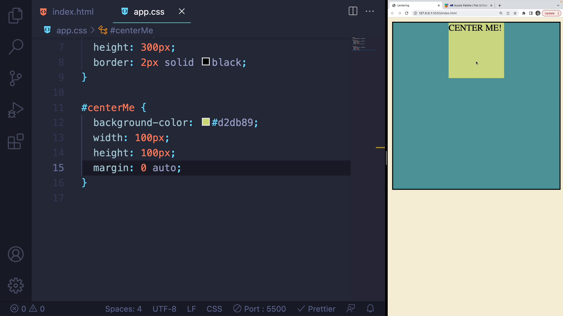
However, this method only centers the element horizontally.
If we try to use auto for the top and bottom, it won't center the element vertically.
We could add some margin to the top and bottom, for example a value of margin: 20px auto;:
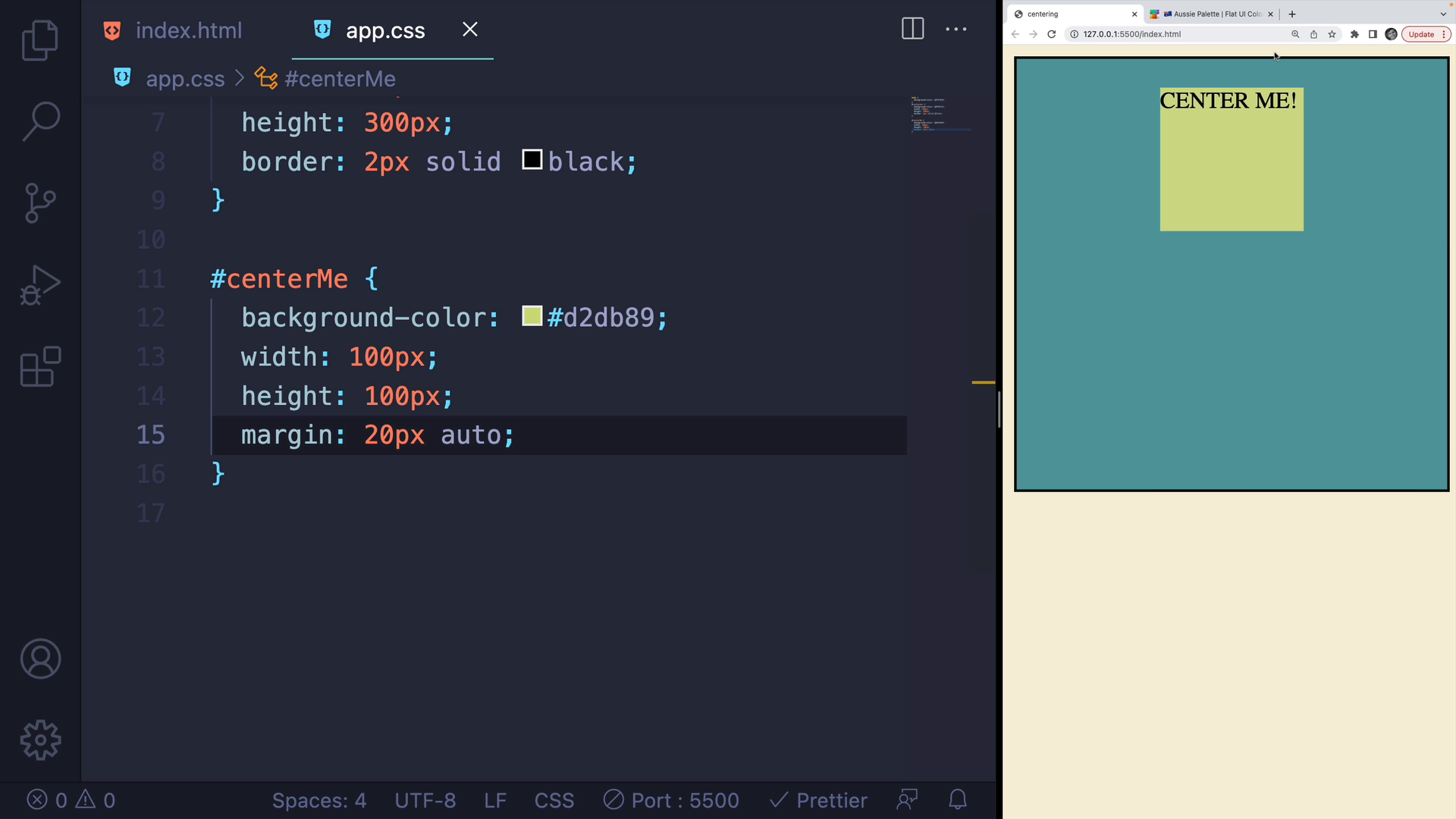
You can see how calculating the exact center vertically can be a huge pain.
The margin technique is best for centering only horizontally.
Centering Horizontally and Vertically with Flexbox
Let's look how to use Flexbox to center an element horizontally and vertically.
Flexbox can be a bit overwhelming for beginners, but we'll only focus on a few properties here.
Most Flexbox properties are set on the containing element itself.
We'll start by enabling Flexbox by adding a display of flex on the container div.
#container { background-color: #549fa2; width: 300px; height: 300px; border: 2px solid black; display: flex;}
You won't see much of a difference until we add a couple of different properties.
First, we'll add the align-items property and set it to center. This will center elements vertically:
#container { /* existing rules above */ display: flex; align-items: center;}
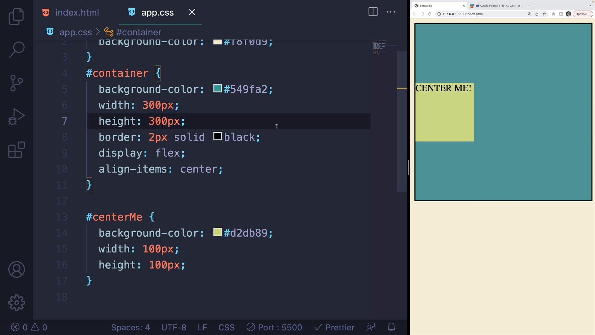
The alignment depends on the flex-direction. If you change the direction to a column, it will center the content horizontally.
Now if we add the justify-content property and set it to center, it will center the content horizontally and vertically within the container, regardless of the size of the container:
#container { /* existing rules above */ display: flex; align-items: center; justify-content: center;}
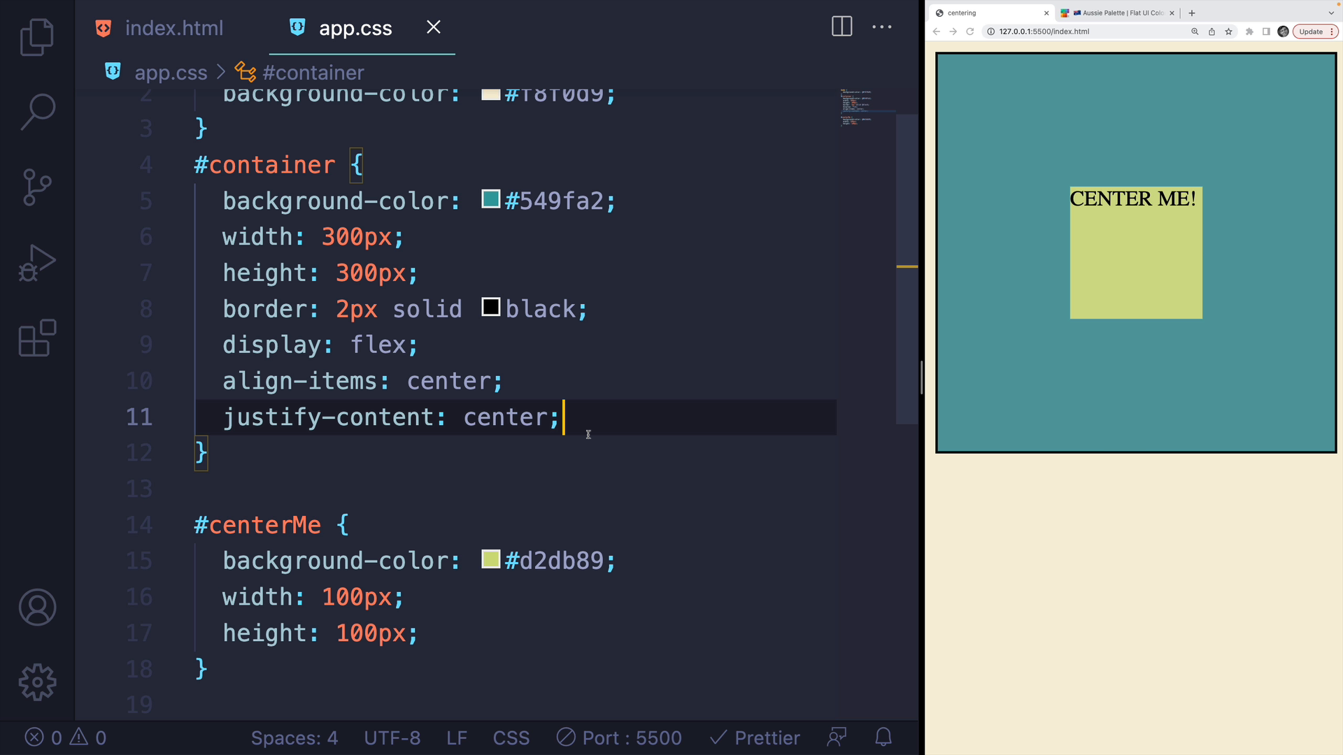
This method will center your content horizontally and vertically within the container, regardless of the container's size. If you change the height or width, the content will remain centered.
Centering with CSS Grid
CSS Grid has its own set of properties that can be used to center elements.
First, set the display property of the #container element to grid:
#container { /* existing rules above */ display: grid;}
Like before, this doesn't change much visually.
Next, we'll use the place-items property to center the content horizontally and vertically.
#container { /* existing rules above */ display: grid; place-items: center;}
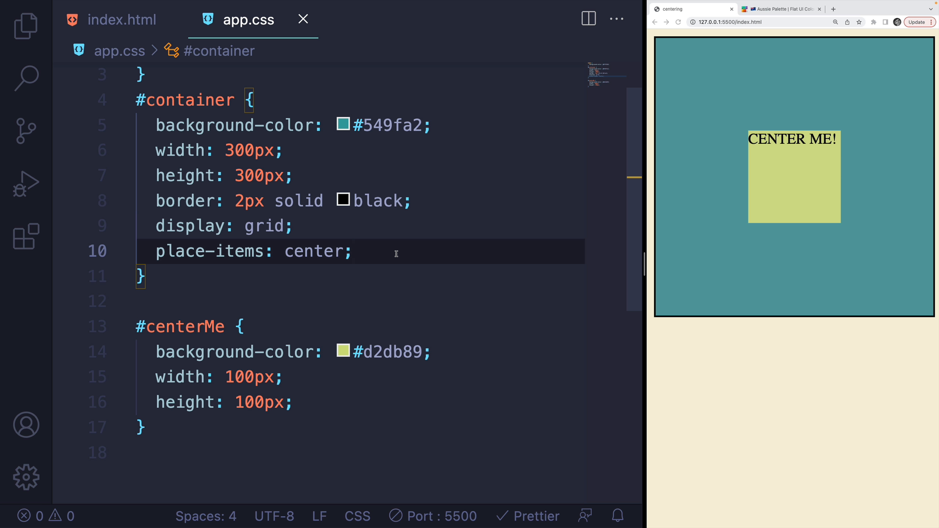
The result is similar to Flexbox, but the place-items property is more straightforward than using justify-content and align-items.
Let's try changing the container dimensions to see how the centered element behaves:
height: 200px;width: 200px;
Like before, the element stays centered in the container, regardless of the container's dimensions.
Wrap-Up
There are many other ways to center elements, including some less convenient ones like using positioning and calc() to perform math on the fly.
However, my preferred method is using display: grid with place-items: center since it makes centering elements simple and straightforward.
Transcript
00:00 In this video, I'll run through some options that you can use to center an element in CSS, both horizontally and vertically. This is a super common situation. I have a very simple example where I have a blue box or a teal, what color is that, bluish, and then a smaller green box in the middle.
00:18 And I would like to center this box inside the container. So my markup is very straightforward. I have a container, that's the blue thing, and then I have a div with the ID of center me, that's the greenish color, sort of a light puke color. So I want to center this.
00:35 The first option I'll show you is how to center it horizontally using margin. This is very simple. Here's my div that I want to center. I can set the margin using the shorthand, which takes a whole bunch of different values, but I can provide a top and a bottom value of zero, or I could add some margin on the top and the bottom.
00:54 And then a very special value of auto for the left and the right. And that centers the element horizontally within its parent container. Now it does not work if I try to do auto on the top and bottom. It only centers it horizontally. I could add in some margin, like 199 pixels on the top and the bottom.
01:13 Well, this container is 200 pixels tall, so I don't think that's going to work. Maybe 20 pixels. You can see that I could do math and try and center it in the exact middle vertically, which is just a huge pain. This is a very quick and easy way to center something horizontally,
01:29 but now let's talk about centering things vertically and horizontally. And the first option I'll show you is to use Flexbox. Flexbox can be a bit overwhelming if you're a complete beginner. I'm only going to show a handful of properties. The way that it works is that we actually set the properties, a lot of the properties, on the containing element itself.
01:48 So the first thing I have to do is turn Flexbox on by setting display to flex. We won't really see much of a difference. Then there are two properties. The first one I'll show you is align items, and we can set that to center. And this will center elements, in this case, vertically.
02:05 Technically, it depends on the flex direction, which is not something we're not going to get into that. But if I change the direction to a column, it will center it horizontally. It doesn't really matter, though, because if we add in the second property, justify content, and we set that to center,
02:20 this will center our content horizontally and vertically within the container, regardless of the size of the container. So if I make it a lot taller, for example, like 500 pixels, it still stays centered. If I make the width 150 pixels, it still stays centered. Okay, so that's the Flexbox option.
02:38 And for a while, that was the easiest thing we could do. We also have a CSS grid option. And just like with Flexbox, grid comes with a whole set of properties. It can get overwhelming if you're a complete beginner. The good news is it's super straightforward to center something vertically and horizontally.
02:55 All we have to do is, on the containing element, turn on display to grid. I should mention, if you're new to grid, check out my free grid course on this very website. You can find a link in the top nav bar. It will teach you everything you need to know about grid. Anyway, I'll set display to grid. Don't see much of a difference.
03:12 But then there's a very special property called place items. And if I set that to center, it centers my content horizontally and vertically, just like before with Flexbox, but now it's only two properties. You don't have to worry about, I mean, it's who can remember, justify content, align items. Those names are a little clunky.
03:30 Place items center is pretty straightforward. So it doesn't matter how large. Let's change the height again. Let's go to 200 pixels tall for the container. Let's change the width to be 200 pixels wide. It still stays centered in that container.
03:45 Now there are many other ways of centering elements, including some really clunky ones like using positioning and using calc and doing some math on the fly. It's not very fun. Now with place item center and display grid, it's super straightforward. This is my preferred approach. Flexbox is fine as well.
04:03 And then if you're just centering something horizontally, margin auto, auto for the left and the right, makes it super simple with a single line.